在
上一篇文章中,我们以自定义视图为例
,研究了如何在代码级别使用主题和样式。 在本文中,让我们看一下样式化标准ui元素,尤其是SwitchCompat的几种方法。
目录内容
引言switchStyle的新样式布局样式主题风格。 该主题是通过清单分配的。主题风格。 以编程方式分配主题。其他观点引言
标准UI元素的默认设计并不总是适合设计者。 让我们看一下如何使用SwitchCompat的示例更改元素的外观。
为了解决这个问题,我们需要:- 为SwitchCompat创建自己的样式。
- 以某种方式设置此SwitchCompat样式。
有几种方法可以指定SwitchCompat样式,例如:- 通过style属性为屏幕布局中的每个视图指定。
- 创建具有覆盖的switchStyle属性的主题,然后在清单中为整个应用程序或特定活动分配该主题。 这将更改整个应用程序/活动的视图外观。
- 也可以在激活码中以编程方式设置主题。 如有必要,可以随时更改。
SwitchCompat的新样式
在资源中,创建新的MySwitchStyle样式,通过设置parent从Widget.AppCompat.CompoundButton.Switch继承设计。 您可能不会继承,但是您将必须指定所有值,即使我们不打算更改这些值。
<style name="MySwitchStyle" parent = "Widget.AppCompat.CompoundButton.Switch"> </style>
要更改某些内容,您需要重新定义必需的属性。 属性可以在
文档中找到
。在文档中,我们看到了几个属性。 表示它们就像我们正在用代码访问它们一样(例如,如R.styleable.SwitchCompat_android_thumb)。 我将只解码其中的一部分,因此毫无疑问。 其余目的很容易从文档中了解。
- android:thumb-SwitchCompat活动部分的资源
- track-SwitchCompat固定部分的资源
- thumbTint-允许您根据SwitchCompat的状态以所需的颜色绘制运动部件
- trackTint-允许您根据SwitchCompat的状态为静止的部件上色
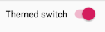
例如,更改拇指(圆圈)的颜色-启用时为橙色,禁用时为绿色。 难看,但很明显。
我们将在资源的color文件夹中需要一个选择器。 文件selector_switch_thumb.xml
<selector xmlns:android="http://schemas.android.com/apk/res/android"> <item android:state_checked="true" android:color = "@android:color/holo_orange_dark"/> <item android:color="@android:color/holo_green_light"/> </selector>
现在以我们的样式设置thumbTint属性。
<style name="MySwitchStyle" parent = "Widget.AppCompat.CompoundButton.Switch"> <item name="thumbTint">@color/selector_switch_thumb</item> </style>
现在,所有以某种方式具有MySwitchStyle样式的SwitchCompat都将以新的方式显示。
布局样式
最琐碎和不灵活的方式。
- 膨胀布局资源时将应用样式。
- 我们不能以任何方式影响软件。
- 每次在布局中指示都很不方便。 我们可以忘记。
<androidx.appcompat.widget.SwitchCompat android:text="Themed switch" style="@style/MySwitchStyle" android:layout_width="wrap_content" android:layout_height="wrap_content"/>
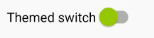
主题风格。 通过清单分配的主题
创建一个AppTheme主题并设置switchStyle属性的值。 值是我们的MySwitchStyle样式。
<resources> <style name="CustomTheme" parent="Theme.AppCompat.Light.DarkActionBar"> <item name="colorPrimary">@color/colorPrimary</item> <item name="colorPrimaryDark">@color/colorPrimaryDark</item> <item name="colorAccent">@color/colorAccent</item> <item name="switchStyle">@style/MySwitchStyle</item> </style> </resources>
可以在清单中为整个应用程序指定主题。
<application android:allowBackup="true" android:icon="@mipmap/ic_launcher" android:label="@string/app_name" android:roundIcon="@mipmap/ic_launcher_round" android:supportsRtl="true" android:theme="@style/CustomTheme"> </application>
或针对特定活动
<activity android:name=".MainActivity" android:theme="@style/CustomTheme"> </activity>
现在,所有SwitchCompat都将焕然一新。 布局没有变化。
- 优点-我们可以立即更改整个应用程序的外观。
- 缺点-您无法即时更改。
主题风格。 以编程方式分配主题
为了以编程方式设置激活主题,您需要调用激活方法setTheme(themeResId)。
让我们根据Switch的状态更改活动的主题。
private const val KEY_CUSTOM_THEME_CHECKED = "KEY_CUSTOM_THEME_CHECKED" class MainActivity : AppCompatActivity() { private val preference by lazy { PreferenceManager.getDefaultSharedPreferences(this) } override fun onCreate(savedInstanceState: Bundle?) { val isCustomThemeChecked = preference.getBoolean( KEY_CUSTOM_THEME_CHECKED, true ) if (isCustomThemeChecked) { setTheme(R.style.CustomTheme) } else { setTheme(R.style.StandardTheme) } super.onCreate(savedInstanceState) setContentView(R.layout.activity_main) customThemeCheckbox.isChecked = isCustomThemeChecked customThemeCheckbox.setOnCheckedChangeListener { _, isChecked -> preference.edit() .putBoolean(KEY_CUSTOM_THEME_CHECKED, isChecked) .apply() recreate() } } }
- 通过调用setTheme以编程方式安装主题。 该方法必须在super.onCreate(savedInstanceState)之前调用。 在onCreate中,我们初始化片段(如果它们是)。
- 根据主题设置交换机的初始状态。
- 我们安装了一个侦听器,该侦听器在更改Switch时会更改设置中的主题,并通过recreate()激活方法重新启动活动。
结果
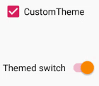
其余代码 <resources> <style name="CustomTheme" parent="Theme.AppCompat.Light.DarkActionBar"> <item name="colorPrimary">@color/colorPrimary</item> <item name="colorPrimaryDark">@color/colorPrimaryDark</item> <item name="colorAccent">@color/colorAccent</item> <item name="switchStyle">@style/MySwitchStyle</item> </style> <style name="StandardTheme" parent="Theme.AppCompat.Light.DarkActionBar"> <item name="colorPrimary">@color/colorPrimary</item> <item name="colorPrimaryDark">@color/colorPrimaryDark</item> <item name="colorAccent">@color/colorAccent</item> </style> <style name="MySwitchStyle" parent="Widget.AppCompat.CompoundButton.Switch"> <item name="thumbTint">@color/selector_switch_thumb</item> </style> </resources>
<LinearLayout xmlns:android="http://schemas.android.com/apk/res/android" android:layout_width="match_parent" android:layout_height="match_parent" android:padding="10dp" android:orientation="vertical"> <CheckBox android:text="CustomTheme" android:layout_width="match_parent" android:layout_height="wrap_content" android:saveEnabled="false" android:id="@+id/customThemeCheckbox"/> <androidx.appcompat.widget.SwitchCompat android:text="Themed switch" android:layout_marginTop="56dp" android:layout_width="wrap_content" android:layout_height="wrap_content" android:id="@+id/themedSwitch"/> </LinearLayout>
其他观点
为了重新定义整个应用程序的SwithView样式,我们重新定义了switchStyle属性的值,我们可以猜测这样的属性存在于其他View中。
例如:
- editTextStyle
- checkboxStyle
- radioButtonStyle
如何寻找他们? 我只是通过Android Studio观看源代码。
我们进入主题,按住Ctrl,然后单击主题的父级。 我们看一下Google的家伙如何描述这个话题。 我们查看确定的属性以及可以继承的样式。 我们用它。
Base.V7.Theme.AppCompat.Light主题的一部分。
<item name="editTextStyle">@style/Widget.AppCompat.EditText</item> <item name="checkboxStyle">@style/Widget.AppCompat.CompoundButton.CheckBox</item> <item name="radioButtonStyle"> @style/Widget.AppCompat.CompoundButton.RadioButton </item> <item name="buttonStyle">@style/Widget.AppCompat.Button</item>
资源资源
developer.android.com/guide/topics/ui/look-and-feel/themesdeveloper.android.com/reference/android/support/v7/widget/SwitchCompat.html#xml-attributes聚苯乙烯本文并不声称是完整的参考。 代码故意缩短。 我将任务设置为大致了解-它如何工作以及为什么需要它。 然后,可以轻松地在文档和标准资源中查找所有内容。