默认情况下,wpf中的样式,Avalonia中的样式是非常中性的,并且并不总是适合于我们需要的任务,并且很少有新手开发人员与他们成为朋友。 在本文中,我想谈一谈使用样式的基础知识,并展示几个有趣的示例。

为什么在Avalonia框架中需要样式?
- 自定义元素时,样式可提供更多自由;
- 不允许重复元素描述;
- 分开标记本身及其设计。
几个例子
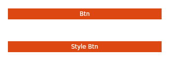
为了更好地理解样式,我们首先来看一个示例:
圆形按钮(类似于ubuntu gnome)
为此,我们将在标准模板(
如何创建模板 )中通过面板堆栈和几个按钮
创建一个简单的标记。
<StackPanel> <Button Margin="20" Content="Btn" /> <Button Margin="20" Content="Style Btn" /> </StackPanel>
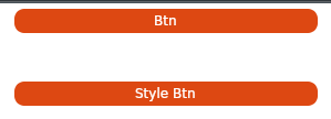
现在,我们可以使用主要背景和字体颜色来处理按钮,但是随后我们将不得不重复代码。 风格将有助于避免这种重复。
在窗口中添加适当的样式:
<Window.Styles> <Style Selector="Button"> <Setter Property="Foreground" Value="#FFFFFFFF" /> <Setter Property="BorderThickness" Value="2" /> <Setter Property="Background" Value="#FFDD4812" /> <Setter Property="BorderBrush" Value="#FFFFFFFF" /> </Style> </Window.Styles>
我们得到了类似的东西,但是最好将边缘弄圆。 不幸的是,无论我们如何尝试,都不可能使按钮的边缘变圆,但是您可以使负责显示按钮的模板的边缘变圆。 为此,请添加另一种样式:
<Style Selector="Button /template/ ContentPresenter"> <Setter Property="CornerRadius" Value="10" /> </Style>

原来几乎类似,但是有一个问题-将鼠标悬停在按钮上时,会出现一个灰色框(来自标准样式的问候)。
为此,请转到
css :pointerover伪类并添加另一种样式:
<Style Selector="Button:pointerover /template/ ContentPresenter"> <Setter Property="BorderBrush" Value="#FFDD4812" /> </Style>
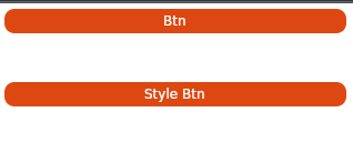
好多了。
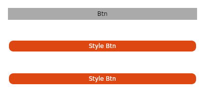
但是,如果我只想将样式应用于特定按钮怎么办?
在模板中再添加一个按钮,然后写入我们要“修饰”
Classes属性的按钮。
<StackPanel> <Button Margin="20" Content="Btn" /> <Button Margin="20" Classes="btn" Content="Style Btn" /> <Button Margin="20" Classes="btn" Content="Style Btn" /> </StackPanel>
然后,我们将指示只影响某些类的样式:
<Style Selector="Button.btn /template/ ContentPresenter"> <Setter Property="CornerRadius" Value="10" /> </Style> <Style Selector="Button.btn"> <Setter Property="Foreground" Value="#FFFFFFFF" /> <Setter Property="BorderThickness" Value="2" /> <Setter Property="Background" Value="#FFDD4812" /> <Setter Property="BorderBrush" Value="#FFFFFFFF" /> </Style> <Style Selector="Button:pointerover.btn /template/ ContentPresenter"> <Setter Property="BorderBrush" Value="#FFDD4812" /> </Style>
所有窗口代码 <Window xmlns="https://github.com/avaloniaui" xmlns:x="http://schemas.microsoft.com/winfx/2006/xaml" xmlns:vm="clr-namespace:Wind1.ViewModels;assembly=Wind1" xmlns:d="http://schemas.microsoft.com/expression/blend/2008" xmlns:mc="http://schemas.openxmlformats.org/markup-compatibility/2006" mc:Ignorable="d" d:DesignWidth="800" d:DesignHeight="450" x:Class="Wind1.Views.MainWindow" Icon="/Assets/avalonia-logo.ico" Title="Wind1"> <Window.Styles> <Style Selector="Button.btn /template/ ContentPresenter"> <Setter Property="CornerRadius" Value="10" /> </Style> <Style Selector="Button.btn"> <Setter Property="Foreground" Value="#FFFFFFFF" /> <Setter Property="BorderThickness" Value="2" /> <Setter Property="Background" Value="#FFDD4812" /> <Setter Property="BorderBrush" Value="#FFFFFFFF" /> </Style> <Style Selector="Button:pointerover.btn /template/ ContentPresenter"> <Setter Property="BorderBrush" Value="#FFDD4812" /> </Style> </Window.Styles> <StackPanel> <Button Margin="20" Content="Btn" /> <Button Margin="20" Classes="btn" Content="Style Btn" /> <Button Margin="20" Classes="btn" Content="Style Btn" /> </StackPanel> </Window>
另一个有趣的样式示例标准复选框如下所示:

略有改进,类似于android(略)
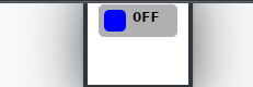
一些魔术 <Window.Styles> <Style Selector="CheckBox.uberbox"> <Setter Property="Template"> <Setter.Value> <ControlTemplate> <Grid> <Border Background="#b0b0b0" Padding="5" BorderBrush="#303030" CornerRadius="5"> <Grid> <Grid Classes="unchecked" ColumnDefinitions=" Auto, Auto"> <Border Width="20" Height="20" Background="Blue" CornerRadius="5" /> <TextBlock FontWeight="Bold" Margin="5,0,0,0" Grid.Column="1">0FF </TextBlock> </Grid> <Grid Classes="checked" ColumnDefinitions=" Auto, Auto"> <Border Grid.Column="1" Width="20" Height="20" Background="Red" CornerRadius="5" /> <TextBlock FontWeight="Bold" Margin="0,0,5,0"> ON </TextBlock> </Grid> </Grid> </Border> <Border Classes="fade" Background="White" CornerRadius="5" /> </Grid> </ControlTemplate> </Setter.Value> </Setter> </Style> <Style Selector="CheckBox.uberbox /template/ Grid.checked"> <Setter Property="Opacity" Value="0" /> </Style> <Style Selector="CheckBox.uberbox:checked /template/ Grid.checked"> <Setter Property="Opacity" Value="1" /> </Style> <Style Selector="CheckBox.uberbox:checked /template/ Grid.unchecked"> <Setter Property="Opacity" Value="0" /> </Style> <Style Selector="CheckBox.uberbox /template/ Border.fade"> <Setter Property="Opacity" Value="0" /> </Style> <Style Selector="CheckBox.uberbox:pointerover /template/ Border.fade"> <Setter Property="Opacity" Value="0.2" /> </Style> </Window.Styles> <StackPanel> <CheckBox Classes="uberbox" Margin="10" /> </StackPanel>
在哪里使用样式
样式可以在窗口中使用(就像我们在上面的示例中所做的那样),
并且在整个应用程序内(然后样式将在所有窗口中应用)。
为此,请将样式添加到
App.xaml文件中
。 <Application.Styles> <StyleInclude Source="avares://Avalonia.Themes.Default/DefaultTheme.xaml"/> <StyleInclude Source="avares://Avalonia.Themes.Default/Accents/BaseLight.xaml"/> <Style Selector="Button"> <Setter Property="Background" Value="Blue"></Setter> </Style> </Application.Styles>
更大的分离
随着代码的复杂化,我们不再希望将样式保留在窗口布局内,而是希望将它们放在单独的文件中:
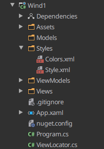
为此,创建Styles目录,然后以xml或xaml文件的形式在其中放置我们的样式,并添加名称空间指令:
<Styles xmlns="https://github.com/avaloniaui" xmlns:x="http://schemas.microsoft.com/winfx/2006/xaml" xmlns:sys="clr-namespace:System;assembly=netstandard"> <Style Selector="Button /template/ ContentPresenter"> <Setter Property="CornerRadius" Value="10" /> </Style> <Style Selector="Button"> <Setter Property="Foreground" Value="#FFFFFFFF" /> <Setter Property="BorderThickness" Value="2" /> <Setter Property="Background" Value="#FFDD4812" /> <Setter Property="BorderBrush" Value="#FFFFFFFF" /> </Style> <Style Selector="Button:pointerover /template/ ContentPresenter"> <Setter Property="BorderBrush" Value="#FFDD4812" /> </Style> </Styles>
将新资源添加到项目文件(* .csproj):
<AvaloniaResource Include="Styles\**" />
并使用
StyleInclude标签连接它们
<Window.Styles> <StyleInclude Source="/Styles/Style.xml"/> </Window.Styles>
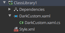
但是有时候这还不够,我想将样式放在一个单独的dll中,以便在我的所有项目中使用。
为此,创建一个ClassLibrary并以资源avaloniya为我们将来的文件提供支持:
<ItemGroup> <AvaloniaResource Include="**\*.xaml"> <SubType>Designer</SubType> </AvaloniaResource> </ItemGroup> <ItemGroup> <AvaloniaResource Include="**\*.xml"> <SubType>Designer</SubType> </AvaloniaResource> </ItemGroup>
现在将熟悉的Styles.xml和另外2个新文件添加到项目中:
在xaml文件中,您必须指定名称空间及其所属的类,以及必需资源的连接:
<Styles xmlns="https://github.com/avaloniaui" xmlns:x="http://schemas.microsoft.com/winfx/2006/xaml" x:Class="ClassLibrary1.DarkCustom"> <StyleInclude Source="avares://ClassLibrary1/Style.xml"/> </Styles>
在cs文件中,我们定义这是一种样式,仅此而已:
namespace ClassLibrary1 { public class DarkCustom:Styles { } }
向我们的库中添加一个依赖项,然后重新连接样式,并使用
StyleInclude和
<Window.Styles> <StyleInclude Source="avares://ClassLibrary1/DarkCustom.xaml"/> </Window.Styles>
一些更有用
请务必查看官方的
Avalonia风格教程(
tyk )
您可以在此处获得有关如何为此或该元素编写样式的基本想法(
tyk )
而且,如果您没有时间/渴望创建自己的样式,则可以使用此出色的样式生成器(
tyk )
我要感谢
ForNeVer kekekeks worldbeater请注意,可以在
此处找到对c#的支持,在
此处可以找到对Avalonia的支持。